Sunday, 28 November 2010

Music Labels

Our music label is named S.O.C productions which is a combination of the first letter of the names of the people in our group.

We were advised that logos for music labels should not contain too many colours, that is why we stuck with the colours black and pink.

The pink, because it is a re-occurring theme in our music video and black, because it connotes professionalism.

"Debbie" is an artist who produces soul/pop rock/R&B music. Therefore we wanted to make sure that our artists on our labels produce similar sounding music

For example LA Face Records is an American music label


The genre of music it produces are mostly R&B and pop rock. Its popular artists include Avril Lavigne who produces mostly pop rock music, Toni Braxton who always produces R&B soulful music and Pink who produces a mixture of Pop rock and R&B. LA face diversifies its music it produces and diversifies its artists as Pink is very different from Toni Braxton

Since we have 2 distinctive age groups in our target audience we really did not want to limit the type of music we produced.

Hollywood Records is owned by the Walt Disney Company as Disney wanted to launch a music label rather than just film. Unlike La FACE records its genre is listed as pop and rock. Hollywood Records is probably very specific because it has a synergy with Disney channel. This means the actors turned artists would be produced by Hollywood records. Demi Lovato, Jonas Brothers, Hilary Duff, Miley Cyrus (Hannah Montana) are all produced by Hollywood records which can explain their success. Also these artists were the artist featured in my mood board signifying they are important figures to our target audience.


S.O.C productions can be likened to LA Face records and Hollywood Records. We want to create a synergy of these 2 existing labels and produce music that includes Pop rock, rock, R&B & Soul music, and be known for producing the music of Disney stars.

Here is an example of the music artists we would like to produce
Justin Beiber currently producing pop-R&B music

Demi Lovato produces pop rock & R&B music. She has featured in popular disney movies such as Camp Rock and stars in her own Disney Show called Sonny With a Chance

Jazmin Sullivan, she is an artist that will very appeal to our older target audience because of her strong vocals. She produces R&B, soul, and pop music

Saturday, 27 November 2010

Use of Digipaks

Do you think Digipaks are an outdated form of music promotion, What is the best form of music Promotion


Digipaks are mostly used for CD singles and special editions of CDs.

It was trademarked by several companies in 2000 which was 10 years ago. There has been a significant change in culture to the promotion of artists since 2000 therefore I believe that the use of digipaks is usually outdated by they might be important when launching a new artist because the digipak could be used as memorabilia.

Changes in Promotions
Myspace


Myspace was originally just a social networking site where people all over the world could set up personalised accounts and talk to friends via the internet. It expanded and also became a starting block for artists to feature their music. Nowadays a lot of artists have been discovered through Myspace. Myspace also expanded to become Myspace Music where artists can feature their music and music videos. This is another way to become recognised to the public if you are an upcoming music artist

You-tube

Youtube is probably by far the most popular form of promotional for anyone regardless of if you are a musician. It is a video sharing website where you can upload videos and watch videos. Specifically Justin Beiber was discovered on you tube by just uploading videos of him singing he is now regarded to some people, specifically those in our target audience, as iconic in the pop rock music genre.


Music Review Sites
Pitchfork
Metacritic
Music Critic
MTV
Billboard


These are a couple of online musical reviews. I think this is a better promotional tool for artists than digipaks. This could relate to the issue of hegemony as people could think people like Music journalists or album reviewers, that critique albums are specialised in a way to understand what is "good music" and what is "bad music" therefore what they say about an artist's music is influential because it could popularise an artist or it could be an end to the career depending on the critique.

Analysis of our Digipack


This was our finished digipack. From the first digipack I posted we the creativity of the pictures and editing of the pictures look better. We knew digipacks gave the chance for artists to express their creativity and a bit of their personality that is why our artist is posing in both of her outfits which both represent her as a person. She is Debbie as the diva expressed through the dress then Debbie as normal expressed through the pyjamas it was important for our audience to see this in the digipack because some may like one side of her better than the other

We also included the track list of songs because this appears on mostly all digipacks. We also included an inspirational quote from an inspirational woman so perhaps Debbie's fans can view her as a role model

Wednesday, 24 November 2010

Photoshoot November 24th

After our first photoshoot and after making our first digipak overall as a group we were not satisfied with the photos so we decided to take more pictures today.

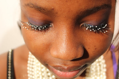
By purchasing things that would appeal to our target audience such as hot pink and sparkly brown eyeshadow, lip stick, false eye lashes we thought this would make the photo shoot better and we also thought that it would stand out more in our magazine advert and digipak.

Preparation

We had to make sure the 3 point lighting was set up (back, filler and key lights) so that the pictures would appear better once uploaded on the computer. I was also making sure to be more inventive with the poses and camera angles that I took the photographs so that they wouldn't all look the same.

Camera angles included high angles, low angles, and Point of View angles, and side angles.

We also had close ups, long shots and medium shots

We also asked our singer to be more 'playful' so it would appeal to the target audience


After the photoshoot we had roughly around 300 photos to choose from that would appear on our digipak and our magazine advert


Sunday, 21 November 2010

Digipak Training

Digipak training took place on a software called Photoshop.

Here we got to experiment with the programme and manipulate the pictures, and text to suit how we wanted.

The Basics
1) Every picture or image on Photoshop is on a layer
2) Name the layers so you know which picture or text you are working with
3)Press shift when you are resizing an image/text so the composition does not change
4)Lasso tool allows you to select parts on image that you want to choose
Go to Select, Inverse, then backspace when you want to get rid of parts of an image
5) Your image cannot go over the 'spine' on the digipak.


Unfortunately the images we had taken for our digipak could not be obtained on my PC so I had to practise using Photoshop with other images.


I also had the chance to play around with the text and change the colour and font

Wednesday, 17 November 2010

Photoshoot November 17th

On this day we had our first photo shoot with our singer. These were the pictures we were going to use for the digipak and magazine advert.

We brought the props that we needed to take photos of such as the pink radio, high heels, and pearls.

We also brought a white glossy sheet so the pictures of the props would create a professional look if they were placed upon the sheet.


This is an example of how the pictures looked when they were made on our digipak


Sunday, 14 November 2010

Photoshoot Training

n this tutorial we learned about the important things to remember in order to take a good photo. This tutorial was lead by an professional photographer.

The 4 basic things we need to remember when taking a photo is
Composition
Lighting
Exposure
Post production


Composition dealt with the rule of thirds meaning that when we take a picture we imagine the picture as we are looking into a grid. The object we are taking the photo of should lie in the points of that grid because this is where peoples eyes are drawn to in a photograph.

However all photos don't have to necessary follow this rule.

Exposure- This deals with high key lighting and low key lighting. When taking pictures using high key lighting, we were advised to use a big white light

Low key lighting uses harsher lights and have mysterious feel to them.

Lighting - this is the difference between low key lighting and high key lighting. High key lighting is usually used in fashion magazines and beauty magazines to emphasize someone's beauty whereas low key lighting would be in adverts trying to create a mysterious, scary atmosphere like a poster for a horror movie.

Post production - this deals with everything after you've taken the photo such as editing, and resizing

We also attempted to replicate a professional photo and experiment with the lighting and composition of our volunteer to see how to take a professional photo.

Mood Board with Pictures

These images in the mood board are things popular for our target audience. There are musicians of good talent like VV Brown for our older target audience of around 16-18 and then popular disney stars and musicians for the younger target audience. The image of the dress relates to both ends of the spectrum of our target audience.

Costume Analysis

Bright pyjamas top, pink leg warmers

We chose to use a bright top that would stand out to our viewers. It is colourful and represents her African culture therefore we can widen the girls we are trying to reach to in our target audience. The leg warmers are pink and bright. Pink represents the theme we are tying to get across.It represents the casual and relaxed nature of our singer.

Black dress with high heels

The black dress represents the other side of our singer. Even though she's bubbly at home with her pyjamas the dress makes her more sophisticated and mature. This also relates to our target audience because we find young girls love to try and dress older and experiment with make up. That is why we showed our singer attempting to put on lipstick because she was trying to look the part. In the older spectrum of our target audience this outfit appeals to them because they can always relate to going out with their friends dressing up and having a fun time at a low key concert

The colour 'black' of the dress represents her trying to be elegant and older as well. Her high heels as well as them being pink to represent our theme it shows her step towards adulthood. Aswell as the silver jewellery it shows the artistic side of her as she is pursuing her music career so she wants to look the part

Saturday, 13 November 2010

Ideas for Digipak

A digipak is usually a 4 or 6 sided spread for a music album.
Our original idea was to have a medium shot of our singer and merge her two lifestyles into one picture.

This would take up one side of the Digipak


This picture is a close up of our singers face. As you can see, it features her in her performative outfit with big hair, earings, lipstick, and also her normal lifestyle, simply in her pyjamas. We plan to merge this into one picture and feature it on a page on our digipak

The rest of the pages in our digipak we would put pictures of the props we see in the music video such as her shoes, legwarmers, microphone, and scarf.

On one page, possibly at the back page,
we would include the list of songs that feature on the album.


Sunday, 7 November 2010

Photo Shoot Plan

People needed - Debbie the Singer

Costume needed - Two outfit changes
1) Bright coloured pyjamas
pink leg warmers
black tights

2) Black dress
silver necklaces and earrings
scarf
pink high heels

Props - pink radio, microphone, lipstick

Lighting - High key lighting if possible, with soft pink filler lights in the background

Location - TV studio and a house