
Welcome to my blog where I will take you through the production of an A2 Music Video
Saturday, 18 December 2010


Thursday, 16 December 2010
Evaluation Question 3
Feedback from project proposal
Feedback from Rough cut
Feedback from Digipack
Feedback from Final video, logo, magazine advert
Overall Feedback


Feedback from Rough cut
Feedback from Digipack
Feedback from Final video, logo, magazine advert
Overall Feedback


Monday, 13 December 2010
Evaluation Question 1
In what ways does your media product use, develop or challenge forms conventions of real media products?

1)The first shot is of our singer touching her hair this shows the link between the music video and lyrics because as she touches her hair the lyric sings "and I miss your tender hair". However, we did not want to consistently link the visuals with the lyrics.
2)In this shot our artist is playfully putting on lipstick and is wearing her pyjamas. This is how we want to represent our artist as our target audience can relate to her as they are not the kind to be picky with what they are wearing so they can relate to our artist who opts to dress in pyjamas. However we also want to represent our artist with talent which she also has.
3) This shot of the drums relates to our soulful pop rock artist. This is because our singer is a real artist who does not rely on music techniques such as auto-tune to help her sing better as she has a soulful voice. This genre does however use instrumentals such as drums, and guitars to better their performance. Also, the shot can relate to the older spectrum of our target audience because they may have gone to a soulful gig with a performer that has their drummer with them
4) This shot of our artist waking up and magically her face and outfit look perfect and is a talented singer is an example of intertextuality commonly used in music videos but also commercials and films.
5)This shot is a good use of a birds eye view camera angle. To take the scene I had to stand on a chair on my tip toes and also extend the camera really high so it would actually look like it was taken from a high angle. Also the mis-en-scene of the black infinity lighting didn't run throughout the whole location so I had to make sure the mis-en-scene of the black lighting was continuous. I also think setting up the 3 point lighting accurately helped in the professionalism of the shot
6) This shot taken of our singer shows effective 3 point lighting because she is not over exposed and the black infinity lighting is good because it does not show the fact it was a curtain we were really using. More importantly we used blue jell lights to spin across our singer. This created the effect that she was really performing at a concert as the lights were on her.
7) The mis-en-scene consists of the lamp, flowers, mirror (also with her concert image in it) and her pyjama top. The lighting is high key lighting so it creates a comfortable atmosphere. This mis en scene can relate to our target audience because they all know the comfort we experience when we are at our home. It then gets across how relatable our artist is to her audience.
8)The shot of our artist going down the stairs with her pyjamas and then in her dress is the main motif we are getting across to our audience of the 2 lives our artists lives. We also got the idea from a Kelly Clarkson's My Life Would Suck Without You video. As Kelly has a performative and normal sides to her life
9) The shot of the split screens appear in a lot of music videos so we had to include this in our video. It is an innovative technique so as a new artist Debbie should feature this in her video to show she is up to date with this editing technique.

1)The first shot is from Bruno Mars "Just the way you are" video. Here the lyrics frequently relate to visuals because as he sings "oh her eyes, her eyes" he is at the same time drawing her eyes with the tape from the video. I also think this is very creative
2) Justin Beiber is an artist that we would want on our record label as his genre of music is similar to our artist. This typifies him as an artist because he is pictured alongside an already established popular artist, Usher. They are trying to associate Beiber with him to promote his popularity. He is also performing very impressive choreography skills in the video which shows the label wants to promote him as a dancer aswell as a singer
3) This shot is of Miley Cyrus aka Hannah Montana who performs pop rock music. This shots shows the music genre as it shows her band behind her, just like we showed our drums to illustrate our music genre
4) Taylor Swift's, "Love Story" uses intertextuality from the Shakespearan play Romeo and Juliet as this shot shows Taylor and the male actor dressed in the clothes of that era. As she holds the lantern they are secretly meeting as they come from opposing families just like how the story goes in Romeo and Juliet. Taylor also says the names "Romeo and Juliet" in the chorus.
5) This shot is the establishing shot of Rihanna's "Whats my name" video. It is taken from a high angle like our high angle shot (but it is not a birds eye view) I think this is a good shot because it helps the audience determine the location of the video and it must've been difficult to take
6) This shot is from Kanye West's video I think the naturalistic lighting of the orangy reddish sky that contrasts the lighting of the dark trees connote isolation as this lighting does not occur all the time which conveys the video is shot in a foreign place
7)The mis-en-scene in the "only girl" video by Rihanna shows Rihanna with a background of low key lighting created by the sky with bright fireworks going off and Rihanna jumping up and down in the air. Similar to our video I think the mis en scene helps show Rihanna as a relatable artist because she is jumping up and down having fun which anyone could relate to when they are in a happy mood
8) The shot of Kelly Clarkson singing is just a small snippet of her life because the video is like ours; it switches from Kelly performing in a band and in her apartment with her boyfriend arguing. It is like our video but we didn't want to show the relationship aspects of our artist so we can still maintain "squeaky clean" image of our artist
9)The last shot of the split screen is from a hip hop video by B.O.B we wanted to feature this technique in our music video even though we are not a rap genre but because it is a good editing technique
Monday, 6 December 2010
Roughcut Music Video
"Valerie" - Amy Winehouse ft. Mark Ronson
Made by Oyin, Sara, and Chauntelle
When we presented our rough cut we were aiming to receive constructive feedback from our class and teachers so we knew what to improve.
Feedback comments: -Very good lip synching
-Good lighting
-someone said they enjoyed the mirror image, and how the her
clothing changes
-Split screen was good
- end of the video had bad lighting
Overall they were positive comments but with the last comment we knew we probably had to see if we edit the lighting or putting new footage so all we could go from there was continue editing and don't let the standards drop
Record Label Production
To create our music video this was done on a programme called Illustrator. This programme has more advantages of using Photoshop to create logos that is why we opted to use it.
For example Photoshop would use a raster application whereas Illustrator uses a vector application. This means that if we wanted to resize or largen the logo to appear on various things it would loose its quality if we had produced it on Photoshop, on Illustrator the quality and "crispness" still stays the same even if it is resized.
However the same way we used Photoshop to create our magazine advert is the similar concept of Illustrator.
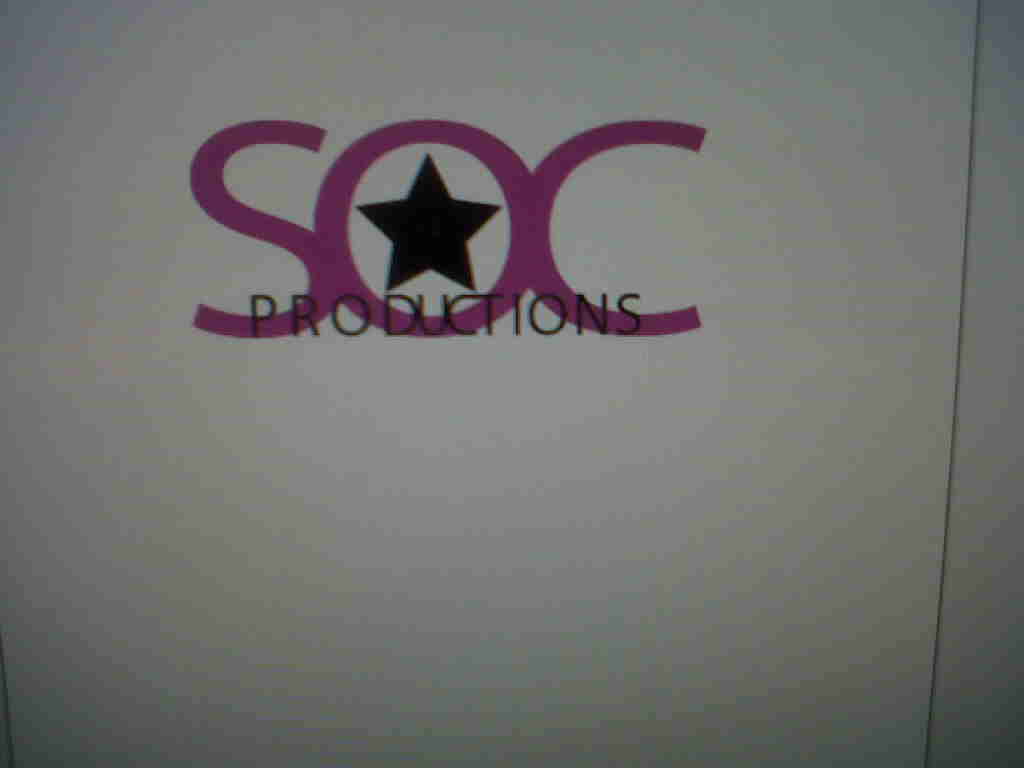
As a group we each took turns in producing a logo. We decided to include the reoccuring motif of pink in the logo but adding professionalism by the word "productions" in bold black.
Here I was creating a logo


For example Photoshop would use a raster application whereas Illustrator uses a vector application. This means that if we wanted to resize or largen the logo to appear on various things it would loose its quality if we had produced it on Photoshop, on Illustrator the quality and "crispness" still stays the same even if it is resized.
However the same way we used Photoshop to create our magazine advert is the similar concept of Illustrator.
As a group we each took turns in producing a logo. We decided to include the reoccuring motif of pink in the logo but adding professionalism by the word "productions" in bold black.
Here I was creating a logo

Sunday, 5 December 2010
Analysis of our Magazine Advert
We chose this image for our magazine advert because we were aiming to produce a beauty shot. From what we learned from photoshoot training, beauty shots are usually close ups because it focuses on the persons face that is why we picked the picture because it would make a good beauty close up. I also liked this image because of the ray of light coming from the right hand corner of the picture. I think this helps to connote our artists stardom. We wanted to use the dress outfit because we thought not only would it appeal to our younger target audience of girls but also the older ones because of the cool funky makeup our artist wears. We made sure to include the featured song Valerie so our audience will remember her for her hit song and they'll more likely get it because they are familiar with it and we made sure to put the release date as December 10th because its near Christmas so more people could buy it for presents
Saturday, 4 December 2010
Production of Magazine Advert
From research of magazine adverts targeted to our audience we knew our magazine should be 1) High Key
2) Not to sophisticated
3) Look appealing meaning that we were most likely to use a high key lighting shot because we were aiming to take a beauty shot
4) Feature our running motif of the colour pink
To make our magazine advert this took place also on Photoshop. The same rules that applied to making a digipak was the same as making a magazine advert such as naming the layers, pressing the shift key always when resizing an image, and also by moving the layers this would affect what would be seen on the image. For example if a layer of the 'tambourine' was underneath the 'background' layer than the tambourine would not be seen.
This is the picture we chose to be the magazine advert


Here I was experimenting with which font would appeal to our target audience

Here I thought we should put the tambourine in the magazine advert because it is the same tambourine our artist uses in the video

In this picture I changed the saturation and brightness and decided on the font style

This was the final magazine advert however receiving feedback from teachers and students that the image looks to "washed out" we decided to change the brightness and saturation of the image. When we showed it to class members for feedback a student mentioned we should change the logo to another logo we had previously produced. Our teacher also mentioned we should add an indication of where we could purchase the album therefore I added the HMV logo. Here is the finished piece

Wednesday, 1 December 2010
Analysis of Magazine Advert for an album
Gwen Stefani
Research on Magazines
Our magazine advert for our music album would have to feature in magazines that are young female children would like to read and also magazines that older girls would be interested. As the content in both of these types of magazines would probably not be interesting f for each girl.
For our younger target audience we would feature it in magazines such as Total Girl, and Girl Power
Again Hannah Montana (Miley Cyrus) is pictured on this cover this shows how iconic she is in this younger female target group which means that our magazine advert should appear here because our target group is interested in things such as this.
For our older target group Seventeen magazine is an ideal magazine to feature our magazine advert inside. This is because the magazine is popularly read by teenage girls therefore it would be a good magazine to promote our album.
Magazine Advert Training
This took place also on Photoshop on an Apple Mac
The same rules applied of making a digipak applied to making a magazine advert.
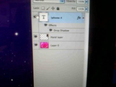
We first practised on a picture already on the PC. We had to select a background photo and apply second layer (which was the picture of the iphone) onto the background.
We practised with the lasso tool selecting just the image of the phone and the hand

The toolbar on the side of the image are the effects that can manipulate the picture you can change the saturation, brightness, add effects such as blurring the picture adding shadows, glows.
The same rules applied of making a digipak applied to making a magazine advert.
We first practised on a picture already on the PC. We had to select a background photo and apply second layer (which was the picture of the iphone) onto the background.
We practised with the lasso tool selecting just the image of the phone and the hand

The toolbar on the side of the image are the effects that can manipulate the picture you can change the saturation, brightness, add effects such as blurring the picture adding shadows, glows.

Subscribe to:
Comments (Atom)