
Welcome to my blog where I will take you through the production of an A2 Music Video
Saturday, 18 December 2010


Thursday, 16 December 2010
Evaluation Question 3
Feedback from project proposal
Feedback from Rough cut
Feedback from Digipack
Feedback from Final video, logo, magazine advert
Overall Feedback


Feedback from Rough cut
Feedback from Digipack
Feedback from Final video, logo, magazine advert
Overall Feedback


Monday, 13 December 2010
Evaluation Question 1
In what ways does your media product use, develop or challenge forms conventions of real media products?

1)The first shot is of our singer touching her hair this shows the link between the music video and lyrics because as she touches her hair the lyric sings "and I miss your tender hair". However, we did not want to consistently link the visuals with the lyrics.
2)In this shot our artist is playfully putting on lipstick and is wearing her pyjamas. This is how we want to represent our artist as our target audience can relate to her as they are not the kind to be picky with what they are wearing so they can relate to our artist who opts to dress in pyjamas. However we also want to represent our artist with talent which she also has.
3) This shot of the drums relates to our soulful pop rock artist. This is because our singer is a real artist who does not rely on music techniques such as auto-tune to help her sing better as she has a soulful voice. This genre does however use instrumentals such as drums, and guitars to better their performance. Also, the shot can relate to the older spectrum of our target audience because they may have gone to a soulful gig with a performer that has their drummer with them
4) This shot of our artist waking up and magically her face and outfit look perfect and is a talented singer is an example of intertextuality commonly used in music videos but also commercials and films.
5)This shot is a good use of a birds eye view camera angle. To take the scene I had to stand on a chair on my tip toes and also extend the camera really high so it would actually look like it was taken from a high angle. Also the mis-en-scene of the black infinity lighting didn't run throughout the whole location so I had to make sure the mis-en-scene of the black lighting was continuous. I also think setting up the 3 point lighting accurately helped in the professionalism of the shot
6) This shot taken of our singer shows effective 3 point lighting because she is not over exposed and the black infinity lighting is good because it does not show the fact it was a curtain we were really using. More importantly we used blue jell lights to spin across our singer. This created the effect that she was really performing at a concert as the lights were on her.
7) The mis-en-scene consists of the lamp, flowers, mirror (also with her concert image in it) and her pyjama top. The lighting is high key lighting so it creates a comfortable atmosphere. This mis en scene can relate to our target audience because they all know the comfort we experience when we are at our home. It then gets across how relatable our artist is to her audience.
8)The shot of our artist going down the stairs with her pyjamas and then in her dress is the main motif we are getting across to our audience of the 2 lives our artists lives. We also got the idea from a Kelly Clarkson's My Life Would Suck Without You video. As Kelly has a performative and normal sides to her life
9) The shot of the split screens appear in a lot of music videos so we had to include this in our video. It is an innovative technique so as a new artist Debbie should feature this in her video to show she is up to date with this editing technique.

1)The first shot is from Bruno Mars "Just the way you are" video. Here the lyrics frequently relate to visuals because as he sings "oh her eyes, her eyes" he is at the same time drawing her eyes with the tape from the video. I also think this is very creative
2) Justin Beiber is an artist that we would want on our record label as his genre of music is similar to our artist. This typifies him as an artist because he is pictured alongside an already established popular artist, Usher. They are trying to associate Beiber with him to promote his popularity. He is also performing very impressive choreography skills in the video which shows the label wants to promote him as a dancer aswell as a singer
3) This shot is of Miley Cyrus aka Hannah Montana who performs pop rock music. This shots shows the music genre as it shows her band behind her, just like we showed our drums to illustrate our music genre
4) Taylor Swift's, "Love Story" uses intertextuality from the Shakespearan play Romeo and Juliet as this shot shows Taylor and the male actor dressed in the clothes of that era. As she holds the lantern they are secretly meeting as they come from opposing families just like how the story goes in Romeo and Juliet. Taylor also says the names "Romeo and Juliet" in the chorus.
5) This shot is the establishing shot of Rihanna's "Whats my name" video. It is taken from a high angle like our high angle shot (but it is not a birds eye view) I think this is a good shot because it helps the audience determine the location of the video and it must've been difficult to take
6) This shot is from Kanye West's video I think the naturalistic lighting of the orangy reddish sky that contrasts the lighting of the dark trees connote isolation as this lighting does not occur all the time which conveys the video is shot in a foreign place
7)The mis-en-scene in the "only girl" video by Rihanna shows Rihanna with a background of low key lighting created by the sky with bright fireworks going off and Rihanna jumping up and down in the air. Similar to our video I think the mis en scene helps show Rihanna as a relatable artist because she is jumping up and down having fun which anyone could relate to when they are in a happy mood
8) The shot of Kelly Clarkson singing is just a small snippet of her life because the video is like ours; it switches from Kelly performing in a band and in her apartment with her boyfriend arguing. It is like our video but we didn't want to show the relationship aspects of our artist so we can still maintain "squeaky clean" image of our artist
9)The last shot of the split screen is from a hip hop video by B.O.B we wanted to feature this technique in our music video even though we are not a rap genre but because it is a good editing technique
Monday, 6 December 2010
Roughcut Music Video
"Valerie" - Amy Winehouse ft. Mark Ronson
Made by Oyin, Sara, and Chauntelle
When we presented our rough cut we were aiming to receive constructive feedback from our class and teachers so we knew what to improve.
Feedback comments: -Very good lip synching
-Good lighting
-someone said they enjoyed the mirror image, and how the her
clothing changes
-Split screen was good
- end of the video had bad lighting
Overall they were positive comments but with the last comment we knew we probably had to see if we edit the lighting or putting new footage so all we could go from there was continue editing and don't let the standards drop
Record Label Production
To create our music video this was done on a programme called Illustrator. This programme has more advantages of using Photoshop to create logos that is why we opted to use it.
For example Photoshop would use a raster application whereas Illustrator uses a vector application. This means that if we wanted to resize or largen the logo to appear on various things it would loose its quality if we had produced it on Photoshop, on Illustrator the quality and "crispness" still stays the same even if it is resized.
However the same way we used Photoshop to create our magazine advert is the similar concept of Illustrator.
As a group we each took turns in producing a logo. We decided to include the reoccuring motif of pink in the logo but adding professionalism by the word "productions" in bold black.
Here I was creating a logo

Sunday, 5 December 2010
Analysis of our Magazine Advert
We chose this image for our magazine advert because we were aiming to produce a beauty shot. From what we learned from photoshoot training, beauty shots are usually close ups because it focuses on the persons face that is why we picked the picture because it would make a good beauty close up. I also liked this image because of the ray of light coming from the right hand corner of the picture. I think this helps to connote our artists stardom. We wanted to use the dress outfit because we thought not only would it appeal to our younger target audience of girls but also the older ones because of the cool funky makeup our artist wears. We made sure to include the featured song Valerie so our audience will remember her for her hit song and they'll more likely get it because they are familiar with it and we made sure to put the release date as December 10th because its near Christmas so more people could buy it for presents
Saturday, 4 December 2010
Production of Magazine Advert
From research of magazine adverts targeted to our audience we knew our magazine should be 1) High Key
2) Not to sophisticated
3) Look appealing meaning that we were most likely to use a high key lighting shot because we were aiming to take a beauty shot
4) Feature our running motif of the colour pink
To make our magazine advert this took place also on Photoshop. The same rules that applied to making a digipak was the same as making a magazine advert such as naming the layers, pressing the shift key always when resizing an image, and also by moving the layers this would affect what would be seen on the image. For example if a layer of the 'tambourine' was underneath the 'background' layer than the tambourine would not be seen.
This is the picture we chose to be the magazine advert


Here I was experimenting with which font would appeal to our target audience

Here I thought we should put the tambourine in the magazine advert because it is the same tambourine our artist uses in the video

In this picture I changed the saturation and brightness and decided on the font style

This was the final magazine advert however receiving feedback from teachers and students that the image looks to "washed out" we decided to change the brightness and saturation of the image. When we showed it to class members for feedback a student mentioned we should change the logo to another logo we had previously produced. Our teacher also mentioned we should add an indication of where we could purchase the album therefore I added the HMV logo. Here is the finished piece

Wednesday, 1 December 2010
Analysis of Magazine Advert for an album
Gwen Stefani
Research on Magazines
Our magazine advert for our music album would have to feature in magazines that are young female children would like to read and also magazines that older girls would be interested. As the content in both of these types of magazines would probably not be interesting f for each girl.
For our younger target audience we would feature it in magazines such as Total Girl, and Girl Power
Again Hannah Montana (Miley Cyrus) is pictured on this cover this shows how iconic she is in this younger female target group which means that our magazine advert should appear here because our target group is interested in things such as this.
For our older target group Seventeen magazine is an ideal magazine to feature our magazine advert inside. This is because the magazine is popularly read by teenage girls therefore it would be a good magazine to promote our album.
Magazine Advert Training
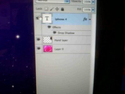
This took place also on Photoshop on an Apple Mac
The same rules applied of making a digipak applied to making a magazine advert.
We first practised on a picture already on the PC. We had to select a background photo and apply second layer (which was the picture of the iphone) onto the background.
We practised with the lasso tool selecting just the image of the phone and the hand

The toolbar on the side of the image are the effects that can manipulate the picture you can change the saturation, brightness, add effects such as blurring the picture adding shadows, glows.

Sunday, 28 November 2010
Music Labels
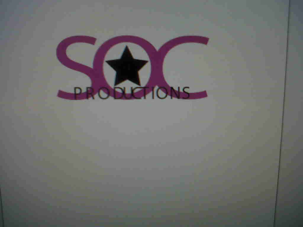
Our music label is named S.O.C productions which is a combination of the first letter of the names of the people in our group.
We were advised that logos for music labels should not contain too many colours, that is why we stuck with the colours black and pink.
The pink, because it is a re-occurring theme in our music video and black, because it connotes professionalism.
"Debbie" is an artist who produces soul/pop rock/R&B music. Therefore we wanted to make sure that our artists on our labels produce similar sounding music
For example LA Face Records is an American music label

The genre of music it produces are mostly R&B and pop rock. Its popular artists include Avril Lavigne who produces mostly pop rock music, Toni Braxton who always produces R&B soulful music and Pink who produces a mixture of Pop rock and R&B. LA face diversifies its music it produces and diversifies its artists as Pink is very different from Toni Braxton
Since we have 2 distinctive age groups in our target audience we really did not want to limit the type of music we produced.
Hollywood Records is owned by the Walt Disney Company as Disney wanted to launch a music label rather than just film. Unlike La FACE records its genre is listed as pop and rock. Hollywood Records is probably very specific because it has a synergy with Disney channel. This means the actors turned artists would be produced by Hollywood records. Demi Lovato, Jonas Brothers, Hilary Duff, Miley Cyrus (Hannah Montana) are all produced by Hollywood records which can explain their success. Also these artists were the artist featured in my mood board signifying they are important figures to our target audience.

S.O.C productions can be likened to LA Face records and Hollywood Records. We want to create a synergy of these 2 existing labels and produce music that includes Pop rock, rock, R&B & Soul music, and be known for producing the music of Disney stars.
Here is an example of the music artists we would like to produce
Justin Beiber currently producing pop-R&B music

Demi Lovato produces pop rock & R&B music. She has featured in popular disney movies such as Camp Rock and stars in her own Disney Show called Sonny With a Chance

Jazmin Sullivan, she is an artist that will very appeal to our older target audience because of her strong vocals. She produces R&B, soul, and pop music

Saturday, 27 November 2010
Use of Digipaks
Do you think Digipaks are an outdated form of music promotion, What is the best form of music Promotion
Digipaks are mostly used for CD singles and special editions of CDs.
It was trademarked by several companies in 2000 which was 10 years ago. There has been a significant change in culture to the promotion of artists since 2000 therefore I believe that the use of digipaks is usually outdated by they might be important when launching a new artist because the digipak could be used as memorabilia.
Changes in Promotions
Myspace

Myspace was originally just a social networking site where people all over the world could set up personalised accounts and talk to friends via the internet. It expanded and also became a starting block for artists to feature their music. Nowadays a lot of artists have been discovered through Myspace. Myspace also expanded to become Myspace Music where artists can feature their music and music videos. This is another way to become recognised to the public if you are an upcoming music artist
You-tube
Youtube is probably by far the most popular form of promotional for anyone regardless of if you are a musician. It is a video sharing website where you can upload videos and watch videos. Specifically Justin Beiber was discovered on you tube by just uploading videos of him singing he is now regarded to some people, specifically those in our target audience, as iconic in the pop rock music genre.
Music Review Sites
Pitchfork
Metacritic
Music Critic
MTV
Billboard
These are a couple of online musical reviews. I think this is a better promotional tool for artists than digipaks. This could relate to the issue of hegemony as people could think people like Music journalists or album reviewers, that critique albums are specialised in a way to understand what is "good music" and what is "bad music" therefore what they say about an artist's music is influential because it could popularise an artist or it could be an end to the career depending on the critique.


Analysis of our Digipack

This was our finished digipack. From the first digipack I posted we the creativity of the pictures and editing of the pictures look better. We knew digipacks gave the chance for artists to express their creativity and a bit of their personality that is why our artist is posing in both of her outfits which both represent her as a person. She is Debbie as the diva expressed through the dress then Debbie as normal expressed through the pyjamas it was important for our audience to see this in the digipack because some may like one side of her better than the other
We also included the track list of songs because this appears on mostly all digipacks. We also included an inspirational quote from an inspirational woman so perhaps Debbie's fans can view her as a role model
Wednesday, 24 November 2010
Photoshoot November 24th
After our first photoshoot and after making our first digipak overall as a group we were not satisfied with the photos so we decided to take more pictures today.


By purchasing things that would appeal to our target audience such as hot pink and sparkly brown eyeshadow, lip stick, false eye lashes we thought this would make the photo shoot better and we also thought that it would stand out more in our magazine advert and digipak.
Preparation
We had to make sure the 3 point lighting was set up (back, filler and key lights) so that the pictures would appear better once uploaded on the computer. I was also making sure to be more inventive with the poses and camera angles that I took the photographs so that they wouldn't all look the same.
Camera angles included high angles, low angles, and Point of View angles, and side angles.
We also had close ups, long shots and medium shots
We also asked our singer to be more 'playful' so it would appeal to the target audience
After the photoshoot we had roughly around 300 photos to choose from that would appear on our digipak and our magazine advert
Sunday, 21 November 2010
Digipak Training
Digipak training took place on a software called Photoshop.
Here we got to experiment with the programme and manipulate the pictures, and text to suit how we wanted.
The Basics
1) Every picture or image on Photoshop is on a layer
2) Name the layers so you know which picture or text you are working with
3)Press shift when you are resizing an image/text so the composition does not change
4)Lasso tool allows you to select parts on image that you want to choose
Go to Select, Inverse, then backspace when you want to get rid of parts of an image
5) Your image cannot go over the 'spine' on the digipak.
Unfortunately the images we had taken for our digipak could not be obtained on my PC so I had to practise using Photoshop with other images.
I also had the chance to play around with the text and change the colour and font

Here we got to experiment with the programme and manipulate the pictures, and text to suit how we wanted.
The Basics
1) Every picture or image on Photoshop is on a layer
2) Name the layers so you know which picture or text you are working with
3)Press shift when you are resizing an image/text so the composition does not change
4)Lasso tool allows you to select parts on image that you want to choose
Go to Select, Inverse, then backspace when you want to get rid of parts of an image
5) Your image cannot go over the 'spine' on the digipak.
Unfortunately the images we had taken for our digipak could not be obtained on my PC so I had to practise using Photoshop with other images.

I also had the chance to play around with the text and change the colour and font
Wednesday, 17 November 2010
Photoshoot November 17th
On this day we had our first photo shoot with our singer. These were the pictures we were going to use for the digipak and magazine advert.

We brought the props that we needed to take photos of such as the pink radio, high heels, and pearls.
We also brought a white glossy sheet so the pictures of the props would create a professional look if they were placed upon the sheet.
This is an example of how the pictures looked when they were made on our digipak
This is an example of how the pictures looked when they were made on our digipak
Sunday, 14 November 2010
Photoshoot Training
n this tutorial we learned about the important things to remember in order to take a good photo. This tutorial was lead by an professional photographer.

The 4 basic things we need to remember when taking a photo is
Composition
Lighting
Exposure
Post production
Composition dealt with the rule of thirds meaning that when we take a picture we imagine the picture as we are looking into a grid. The object we are taking the photo of should lie in the points of that grid because this is where peoples eyes are drawn to in a photograph.
However all photos don't have to necessary follow this rule.
Exposure- This deals with high key lighting and low key lighting. When taking pictures using high key lighting, we were advised to use a big white light
Low key lighting uses harsher lights and have mysterious feel to them.
Lighting - this is the difference between low key lighting and high key lighting. High key lighting is usually used in fashion magazines and beauty magazines to emphasize someone's beauty whereas low key lighting would be in adverts trying to create a mysterious, scary atmosphere like a poster for a horror movie.
Post production - this deals with everything after you've taken the photo such as editing, and resizing
We also attempted to replicate a professional photo and experiment with the lighting and composition of our volunteer to see how to take a professional photo.


Mood Board with Pictures
These images in the mood board are things popular for our target audience. There are musicians of good talent like VV Brown for our older target audience of around 16-18 and then popular disney stars and musicians for the younger target audience. The image of the dress relates to both ends of the spectrum of our target audience.


Costume Analysis
Bright pyjamas top, pink leg warmers
We chose to use a bright top that would stand out to our viewers. It is colourful and represents her African culture therefore we can widen the girls we are trying to reach to in our target audience. The leg warmers are pink and bright. Pink represents the theme we are tying to get across.It represents the casual and relaxed nature of our singer.

Black dress with high heels
The black dress represents the other side of our singer. Even though she's bubbly at home with her pyjamas the dress makes her more sophisticated and mature. This also relates to our target audience because we find young girls love to try and dress older and experiment with make up. That is why we showed our singer attempting to put on lipstick because she was trying to look the part. In the older spectrum of our target audience this outfit appeals to them because they can always relate to going out with their friends dressing up and having a fun time at a low key concert
The colour 'black' of the dress represents her trying to be elegant and older as well. Her high heels as well as them being pink to represent our theme it shows her step towards adulthood. Aswell as the silver jewellery it shows the artistic side of her as she is pursuing her music career so she wants to look the part

Saturday, 13 November 2010
Ideas for Digipak
A digipak is usually a 4 or 6 sided spread for a music album.
Our original idea was to have a medium shot of our singer and merge her two lifestyles into one picture.
This would take up one side of the Digipak


This picture is a close up of our singers face. As you can see, it features her in her performative outfit with big hair, earings, lipstick, and also her normal lifestyle, simply in her pyjamas. We plan to merge this into one picture and feature it on a page on our digipak
The rest of the pages in our digipak we would put pictures of the props we see in the music video such as her shoes, legwarmers, microphone, and scarf.
On one page, possibly at the back page,
we would include the list of songs that feature on the album.
Sunday, 7 November 2010
Photo Shoot Plan
People needed - Debbie the Singer
Costume needed - Two outfit changes
1) Bright coloured pyjamas
pink leg warmers
black tights
2) Black dress
silver necklaces and earrings
scarf
pink high heels
Props - pink radio, microphone, lipstick
Lighting - High key lighting if possible, with soft pink filler lights in the background
Location - TV studio and a house
Saturday, 6 November 2010
Friday, 29 October 2010
Thursday, 28 October 2010
Location Analysis
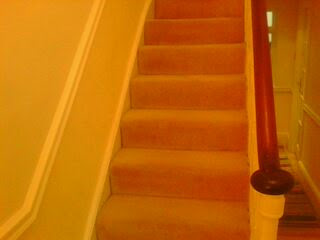
This is an image of the staircase taken in the house where our artist performs. We believe that the staircase was the best place for our artist to show her performative side as it is a common location in a lot of media for an artist/actor to perform for instance in the 1986's movie Ferris Beuller's Day Off, Ferris performs amateurish on his stairs and house. Therefore since it is a popular media convention it goes well with our video
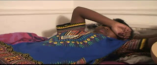
This is the location of our artists bedroom. We chose this location as part of our establishing shot because it denotes that this is the beginning of the music video because it is a comfortable setting and now the audience will automatically associate our artist as a reserved artist because of the simplicity of the opening location
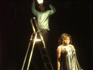
This image is taken from the TV studio. This is the place where the concert takes place because of the equipment the TV studio has it is effective in creating realistic lighting that you would see in a small concert/gig.

Tuesday, 26 October 2010
Training with Final Cut Pro
On this day we had a tutorial on how to use Final Cut Pro which is a software for editing material such as music video available on Apple Computers.
We learnt the basics first:
Alt+X allowed you to get rid of the 'in' and 'out' buttons when you're selecting footage
Apple+Z allowed us to undo
Apple+shift+z allowed us to redo
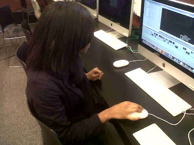
By pressing the space button on the time line while our music track was playing green marks would appear. This helped us for when we were creating cuts to the beat of the song so we were able to achieve on beat editing.
We learnt about Effects, video transitions, colour corrections, and filtering
Monday, 25 October 2010
Representation of women
Since our music video predominatley is focused on a female we can apply Laura Mulvey's theory of the male gaze to our video. She states that women are reduced to inanimate objects in film. She also says in film cameras will focus on the curves of a woman this is usually through the perspective of males. However I think because we are targeting a specific target audience of about 11-18 year old girls we are empowering young girs by our artist. In our camera work we did not focus on things like the curves of a woman because we wanted to stay away from the accepted ideology of portray women in a sexual way. However we portray Debbie in a fun jokingly matter so it can appeal to our target audience
Wednesday, 13 October 2010
Sixth Shooting
This was the last shooting in the tv studio of the drummer and singer though again due to lighting difficulties we will probably reshoot because the quality was not that great
Sunday, 10 October 2010
Locations and Prop list
After brainstorming our ideas we had a better idea as to where we were going to shoot our music video.
Locations
A regular house
TV studio which would represent a concert setting
Props
Mirror
Comb
Lipstick
Radio
Grapes
Drums
Microphone
Costume
Black dress
Pink High Heels
Bright pyjamas
Glittery Jewellery
Reading glasses
Hair piece
Bangles
Locations
A regular house
TV studio which would represent a concert setting
Props
Mirror
Comb
Lipstick
Radio
Grapes
Drums
Microphone
Costume
Black dress
Pink High Heels
Bright pyjamas
Glittery Jewellery
Reading glasses
Hair piece
Bangles
Friday, 8 October 2010
Fifth Shooting
In this scene we were re-shooting the beginning of our music video because of the bad quality we had produced. These scenes were when our singer was just getting up from bed and when she puts the radio on.
Wednesday, 6 October 2010
Fourth Shooting
Today we were shooting in the TV studio so this meant we had to set up our lighting. We were also shooting with the gel lights. Overall we had minimal difficulties conveying what we wanted
Sunday, 3 October 2010
Questionnaire towards our Target Audience
Because our target audience is young we aren't able to post any visual photos of their responses to our questions.
Here are the list of questions I asked my target audience
Crystal, 10
How old are you? 10
Do you like music? Sometimes
When you watch music videos, what are the things you like to see? Well I don't really like watching music videos but I like dancing and I usually like singers but the girl singers.
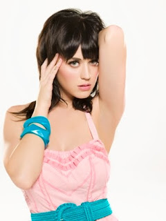
What is your favourite type of music? music like Katy Perry sings
(when we described the concept of our music video towards our interviewee we asked for her opinion) - It sounds like fun music video, and I like the song Valerie and your video kinda reminds me of Hannah Montana because the singer sounds like her.
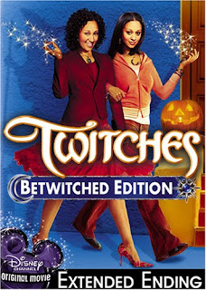
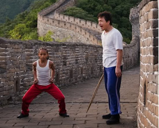
What are your favourite movies? I have a lot like Twitches, Karate Kid
From this interview I was able to get an idea of the type of area we would aim our video towards such as Disney because Hannah Montana, Twitches, are all part of the pop culture of young children that they like.
Towards our older spectrum of our target audience I conducted a video interview and asked the same questions towards our interviewee. From her answers it helped us define what exactly we wanted our music video to include.
Here are the list of questions I asked my target audience
Crystal, 10
How old are you? 10
Do you like music? Sometimes
When you watch music videos, what are the things you like to see? Well I don't really like watching music videos but I like dancing and I usually like singers but the girl singers.
What is your favourite type of music? music like Katy Perry sings
(when we described the concept of our music video towards our interviewee we asked for her opinion) - It sounds like fun music video, and I like the song Valerie and your video kinda reminds me of Hannah Montana because the singer sounds like her.
What are your favourite movies? I have a lot like Twitches, Karate Kid
From this interview I was able to get an idea of the type of area we would aim our video towards such as Disney because Hannah Montana, Twitches, are all part of the pop culture of young children that they like.


Towards our older spectrum of our target audience I conducted a video interview and asked the same questions towards our interviewee. From her answers it helped us define what exactly we wanted our music video to include.
Subscribe to:
Posts (Atom)